
(469) 436-6127

Are you struggling to achieve accurate colors in your DTF transfers? Inconsistent or inaccurate colors can ruin your designs and waste valuable materials. This comprehensive guide will walk you through the essential steps to master dtf transfer color matching, ensuring your prints are vibrant, precise, and consistent every time. We'll cover everything from understanding color profiles and calibration to troubleshooting common issues and selecting the right equipment and materials. Let's dive in and unlock the secrets to perfect color in your DTF transfers!
Table of Contents
At the heart of accurate dtf transfer color matching lies the understanding and proper use of color profiles. A color profile is a set of data that characterizes a color space, allowing devices like monitors, printers, and scanners to reproduce colors consistently. Without proper color profiles, colors can appear different across various devices, leading to inaccurate prints.
ICC (International Color Consortium) profiles are the industry standard for color management. They define the color characteristics of a device or a color space. Using ICC profiles ensures that colors are translated accurately between different devices in your workflow.
Selecting the correct color profile is crucial for achieving accurate colors in your DTF transfers. Here’s what to consider:
For example, if you're using DTF Center's custom DTF transfers, ensure your design software is set to sRGB for optimal color reproduction. You can find more information about design requirements on our [INTERNAL_LINK: FAQ] page.
Your monitor is the window through which you view and adjust your designs. If it's not accurately displaying colors, you'll be making adjustments based on a distorted view, leading to inaccurate prints. Calibrating your monitor is a critical step in dtf transfer color matching.
Over time, monitor colors can drift due to aging, environmental factors, and changes in settings. Calibration ensures that your monitor displays colors accurately and consistently. A properly calibrated monitor allows you to make informed decisions about color adjustments in your designs.
There are two primary methods for calibrating your monitor:
Regardless of the method you choose, be sure to calibrate your monitor regularly (e.g., monthly) to maintain accuracy.
The settings you choose in your printer driver can significantly impact the colors in your DTF transfers. Optimizing these settings is essential for achieving accurate dtf transfer color matching.
Refer to your printer's manual for specific instructions on accessing and adjusting these settings.
RIP (Raster Image Processor) software provides advanced color management capabilities that go beyond what's available in standard printer drivers. Using RIP software can significantly improve the accuracy and consistency of your dtf transfer color matching.
RIP software translates your design files into a format that the printer can understand. It also offers advanced features for color profiling, ink management, and halftone screening.
Popular RIP software options for DTF printing include CADlink Digital Factory, AcroRIP, and Wasatch SoftRIP.
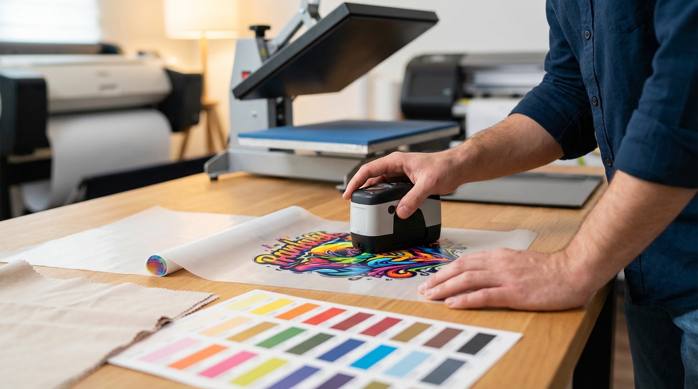
The heat press settings you use can also affect the colors in your DTF transfers. Optimizing these settings is crucial for achieving accurate dtf transfer color matching.
Always follow the manufacturer's recommendations for heat press settings. It's also a good idea to test different settings on scrap fabric to find the optimal combination for your specific materials.
Achieving perfect dtf transfer color matching often requires a process of testing and iteration. Don't be afraid to experiment with different settings and materials to find what works best for you.
Before printing a large batch of transfers, always create test prints to evaluate the color accuracy. Compare the test prints to your original design on your calibrated monitor. If the colors don't match, adjust your settings and create another test print. Repeat this process until you achieve the desired results.
Keep a detailed record of your printer settings, RIP software settings, and heat press settings for each material and design. This will help you reproduce consistent results in the future and troubleshoot any issues that may arise.
Even with careful planning and execution, you may encounter color issues in your DTF transfers. Here are some common problems and how to solve them:
If you're still experiencing color issues, consult with your printer manufacturer, ink supplier, or RIP software provider for assistance.
The best color profile for DTF printing depends on your specific printer, ink, and transfer film. However, a good starting point is to use the color profile recommended by your printer manufacturer or ink supplier. You can also create a custom color profile using RIP software for even more accurate results. For designs intended for web viewing, sRGB is generally recommended.
It is recommended to calibrate your monitor at least once a month for consistent color accuracy. If you notice any color drift or inconsistencies, you may need to calibrate it more frequently.
While you can use CMYK color profiles for DTF printing, it's generally recommended to use RGB color profiles, especially sRGB, as DTF printers often use a wider color gamut than traditional CMYK printers. Using an RGB profile can result in more vibrant and accurate colors.
Mastering dtf transfer color matching requires a combination of knowledge, technique, and attention to detail. By understanding color profiles, calibrating your monitor, optimizing printer settings, leveraging RIP software, and fine-tuning heat press settings, you can achieve accurate and consistent colors in your DTF transfers. Remember to test and iterate, and don't be afraid to experiment to find what works best for your specific equipment and materials. With practice and persistence, you'll be able to produce stunning DTF transfers that meet your expectations every time.
DTF Center provides high-quality custom DTF transfers and UV DTF stickers with same-day shipping and local pickup options. We specialize in durable prints for apparel and promotional items, ensuring vibrant colors and lasting results. Contact us today to learn more about our services and how we can help you achieve your printing goals.